弹性布局的一个有趣问题:宽度超长溢出
发布时间: 2025-11-19
前言
在弹性布局(flex、grid、table-cell)中,会有一种有趣且常见的宽度失效问题。
我生成了一个复现问题的最小demo,左侧里面放了一个 form 表单,form 表单中某一个field的 control 位置放了一个表格,然后这个表单就会撑开宽度, 导致整个左侧的宽度都被撑开,
先看看复现问题的最小demo
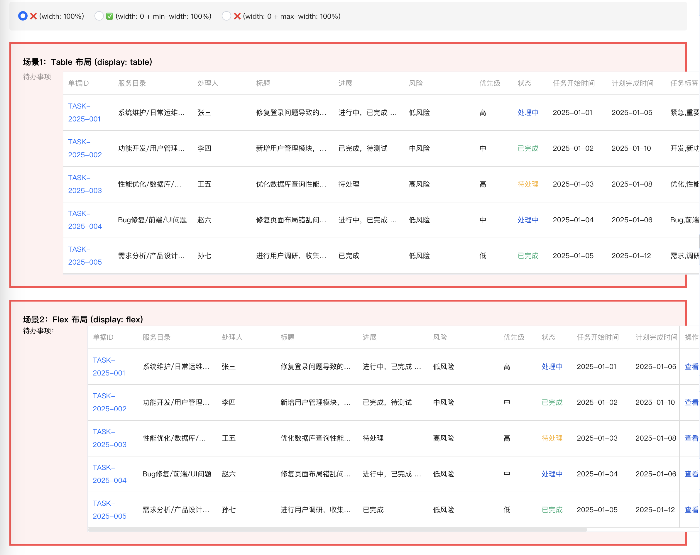
首先看看,当给表格的容器设置宽度100%时,此时表格宽度是溢出的
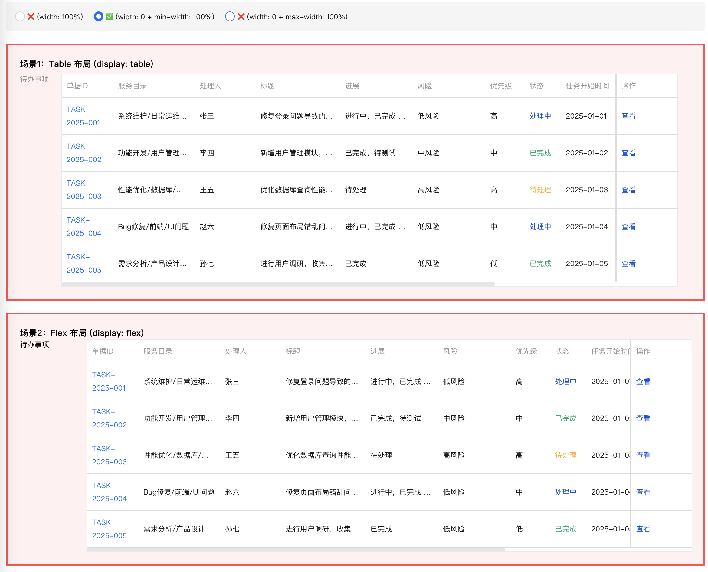
然后看看给他的容器设置宽度0,min-width 100%时,此时正常
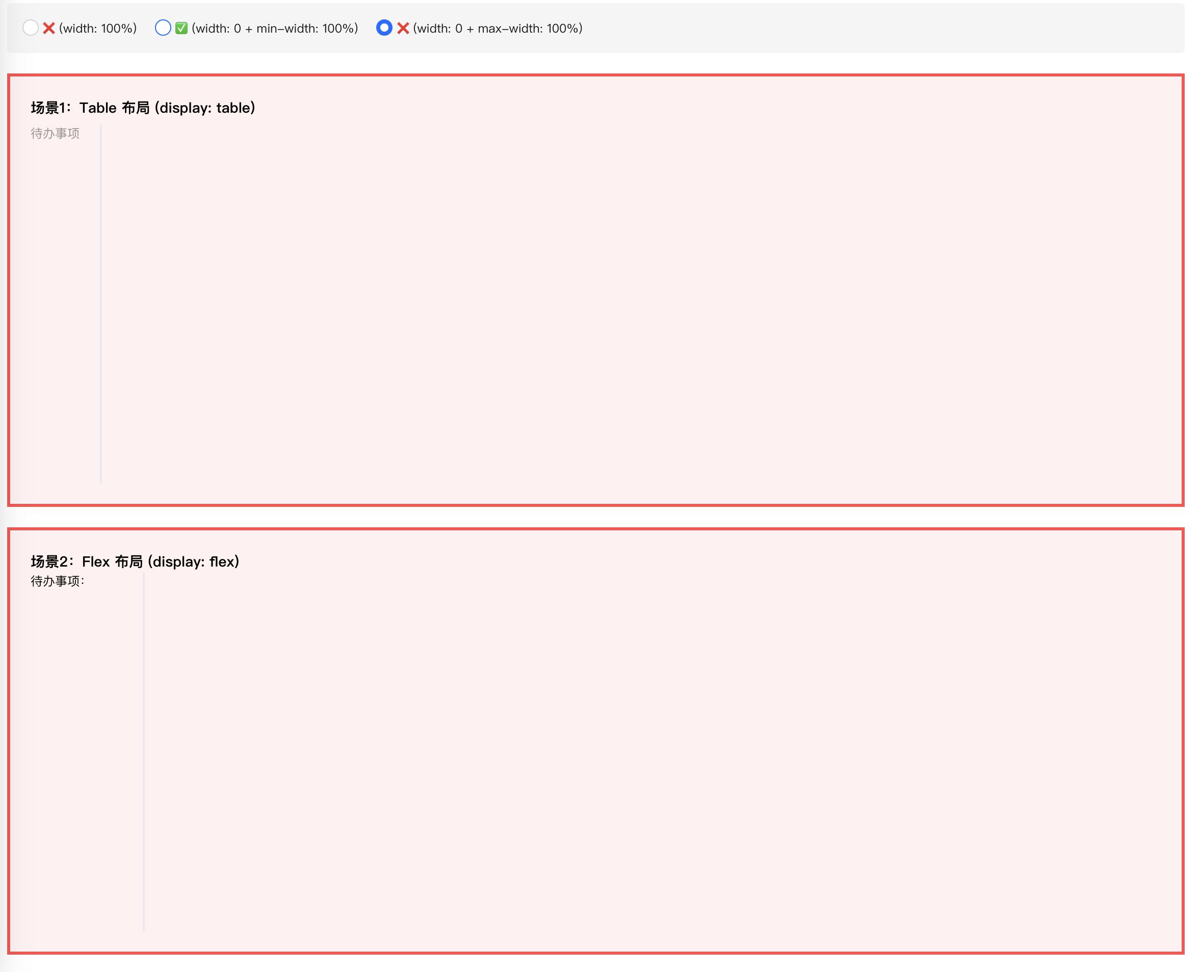
然后是设置宽度0,max-width 100%时,此时表格的宽度是0
我们来看看代码,分为了两个组件,一个主组件,一个表格组件
import React, { useState } from 'react';
import { Form, Radio } from '@tencent/tea-component';
import { MockTodoTable } from './mock-todo-table';
import './original-layout-demo.less';

export const OriginalLayoutDemo: React.FC = () => {
  const [mode, setMode] = useState<'0' | '1' | '2'>('0');

  return (
    <div className="original-layout-demo">

      <div className="demo-controls">
        <Radio.Group value={mode} onChange={setMode as any}>
          <Radio name="0">❌  (width: 100%)</Radio>
          <Radio name="1">✅  (width: 0 + min-width: 100%)</Radio>
          <Radio name="2">❌  (width: 0 + max-width: 100%)</Radio>
        </Radio.Group>
      </div>

      {/* 场景1:Table 布局 (原始 Form) */}
      <div className={'task-layout'}>
        <h3>场景1:Table 布局 (display: table)</h3>
        <Form>
          <Form.Item label="待办事项" className="todo-table-form-item">
            <MockTodoTable disabled mode={mode} />
          </Form.Item>
        </Form>
      </div>

      {/* 场景2:Flex 布局 */}
      <div className={'task-layout'} style={{ marginTop: 20 }}>
        <h3>场景2:Flex 布局 (display: flex)</h3>
        <div style={{ display: 'flex', alignItems: 'flex-start', gap: 10 }}>
          <div style={{ minWidth: 100, flexShrink: 0 }}>待办事项:</div>
          <div style={{
            width: '100%',
          }}>
            <MockTodoTable disabled mode={mode} />
          </div>
        </div>
      </div>

      {/* 场景3:Grid 布局 */}
      <div className={'task-layout'} style={{ marginTop: 20 }}>
        <h3>场景3:Grid 布局 (display: grid)</h3>
        <div style={{ display: 'grid', gridTemplateColumns: '100px 1fr', gap: 10 }}>
          <div>待办事项:</div>
          <div style={{ width: '100%' }}>
            <MockTodoTable disabled mode={mode} />
          </div>
        </div>
      </div>

    </div>
  );
};
import React, { useMemo } from 'react';
import { PrimaryTable } from 'tdesign-react';
import './mock-todo-table.less';


interface MockTodoTableProps {
  disabled?: boolean;
  mode?: '0' | '1' | '2'
}

export const MockTodoTable: React.FC<MockTodoTableProps> = ({ disabled = false, mode = '0' }) => {
  const style = useMemo(() => ({
    0: { width: '100%' },
    1: { width: '0', minWidth: '100%' },
    2: { width: '0', maxWidth: '100%' },
  }[mode]), [mode]);
  // Mock 数据 - 模拟真实的待办事项数据
  const mockData = [
    {
      subTaskId: 'TASK-2025-001',
      subTaskLink: '#',
      contents: '系统维护/日常运维/性能优化',
      toDoManager: '张三',
      toDoDescription: '修复登录问题导致的用户无法正常访问系统,需要优化数据库查询性能',
      toDoProgress: '进行中,已完成 60%,预计明天完成',
      risk: '低风险',
      priority: '高',
      toDoStatus: 'processing',
      startTime: '2025-01-01',
      cusReqTime: '2025-01-05',
      tags: '紧急,重要,系统维护',
      toDoItemsTime: '2天3小时',
      action: 'edit',
    },
    ......
  ];

  // 状态映射
  const statusMap: Record<string, string> = {
    pending: '待处理',
    processing: '处理中',
    completed: '已完成',
    cancelled: '已取消',
  };

  // 状态样式映射
  const STATUS_CLASS_MAP: Record<string, string> = {
    pending: 'status-pending',
    processing: 'status-processing',
    completed: 'status-completed',
    cancelled: 'status-cancelled',
  };

  // 完全复制原始 TodoTable 的列配置
  const columns = [
    {
      colKey: 'document',
      title: '单据ID',
      width: 85,
      fixed: 'left' as const,
      cell: ({ row }: any) => (
        <a href={row.subTaskLink} target="_blank" rel="noopener noreferrer">
          {row.subTaskId}
        </a>
      ),
    },
    {
      colKey: 'contents',
      title: '服务目录',
      width: 135,
    },
    {
      colKey: 'toDoManager',
      title: '处理人',
      width: 100,
    },
    {
      colKey: 'toDoDescription',
      title: '标题',
      width: 140,
    },
    {
      colKey: 'toDoProgress',
      title: '进展',
      width: 120,
    },
    {
      colKey: 'risk',
      title: '风险',
      width: 120,
    },
    {
      colKey: 'priority',
      title: '优先级',
      width: 65,
    },
    {
      colKey: 'toDoStatus',
      title: '状态',
      width: 60,
    },
    {
      colKey: 'startTime',
      title: '任务开始时间',
      width: 100,
    },
    {
      colKey: 'cusReqTime',
      title: '计划完成时间',
      width: 100,
    },
    {
      colKey: 'tags',
      title: '任务标签',
      width: 200,
    },
    {
      colKey: 'toDoItemsTime',
      title: '耗时',
      width: 120,
    },
    {
      title: '操作',
      colKey: 'operate',
      width: 100,
      fixed: 'right' as const,
      .......
    },
  ];

  // 计算总宽度

  return (
    <div className="table-area" style={style}>
      <PrimaryTable
        rowKey="subTaskId"
        className="mock-table"
        size="small"
        hover
        data={mockData}
        columns={columns}
      />
    </div>
  );
};
原因简单分析
从源码可以看到,实际上问题都是出现在弹性布局中,这个问题在常规的块级布局是不存在的,因为常规块级元素 父容器不会依赖子元素的宽度来计算自身宽度,但是在弹性布局中(包括grid、flex、table-cell)他们父元素在计算自身宽度 的时候,会依赖子元素的宽度。而上面的demo中,恰好是遇到,子元素的宽度(所有列表项的宽度)计算出来是1400多px, 而父元素设置的宽度100%,实际它判断出子元素需要1000多px,于是弹性扩展了自己的宽度。
计算流程
来简单理一下这个宽度计算流程,首先简化上面的dom结构
  <div class="flex-container" style="display: flex">  <!-- 父父元素,width: auto -->
    <div class="flex-item" style="width: 100%">       <!-- 父元素,width: 100% -->
      <div class="table-area" style="width: 100%">    <!-- 子元素,width: 100% -->
        <PrimaryTable />                              <!-- 孙元素,实际宽度1445px -->
      </div>
    </div>
  </div>
步骤1:计算 .flex-container 的宽度
.flex-container 的 width: auto(默认值)
需要根据内容计算,计算.flex-item的宽度
步骤2:计算 .flex-item 的内容宽度
.flex-item 的 width: 100%
问:我的宽度是 100%,那 100% 是多少?
答:需要知道父元素(.flex-container)的宽度
但是!父元素正在等我告诉它内容宽度!
这就形成了循环依赖!
根据 W3C 规范的解决方案:
在计算内容宽度时,把 width: 100% 视为 auto
调用:计算 .table-area 的内容宽度
步骤3:计算 .table-area 的内容宽度
.table-area 的 width: 100%
同样的问题:需要知道父元素(.flex-item)的宽度
但父元素也在等我告诉它内容宽度!
根据规范:把 width: 100% 视为 auto
调用:计算 PrimaryTable 的宽度,
最终宽度:1445px
步骤4:回溯计算
现在开始回溯:
.table-area 的内容宽度 = 1445px
↓
.flex-item 的内容宽度 = 1445px
↓
.flex-container 的宽度 = 1445px(根据内容)
步骤5:
现在 .flex-container 的宽度确定了:1445px
.flex-item 的 width: 100%
= .flex-container 的 100%
= 1445px
.table-area 的 width: 100%
= .flex-item 的 100%
= 1445px
.flex-item 说:“我的宽度是父元素的 100%”
.flex-container 说:“我的宽度根据你的内容计算”
这就形成了循环!设置宽度0+min-width 100%组合在一起使用,恰好打断了这个依赖。
根据我去查阅相关文档,width、min-width、max-width他们的作用优先级
| 条件 | 最终宽度 |
|---|---|
| min-width ≤ width ≤ max-width | width |
| width < min-width | min-width |
| width > max-width | max-width |
| min-width > max-width | min-width |
width: 0;:将元素的首选宽度设置为 0,相当于主动放弃元素自身的宽度计算(比如内容撑开的宽度、默认的块级 100% 宽度等)。
min-width: 100%;:设置元素的最小宽度下限为父容器的 100% 宽度,根据我们之前讲的优先级规则,当width小于min-width时,元素最终宽度会取min-width的值。
最终效果:元素的宽度被强制固定为父容器的 100%,且不会被自身内容或其他样式干扰,是一种 “强约束的 100% 宽度继承”。
最后
width: 0; 结合 min-width: 100%; 是一种在 CSS 布局中非常巧妙的特殊设置, 主要用于强制元素宽度继承父容器的 100% 宽度,同时解决一些常规布局中难以处理的自适应问题, 尤其在Flex 布局、Grid 布局或嵌套容器中非常有效。